I’ve been spending quite a bit of time creating frames for Diane’s work lately. First off, there is an upcoming show that she has two pieces accepted. That show is put on by the Portrait Artists of Arizona of which she is a member. This show opens May the fifth so that deadline is looming ever closer. One frame is complete for that show and the other was just glued up an hour ago. There was another focus for the frame frenzy and that was that Diane’s gallery, Meyer-Vogel in Charleston wanted to change out some of her work they currently have shown. We had the appropriate frames for most of them but one in particular, Almost Summer didn’t.
I wrote about that frame and included a video of how its diamond motif was laid out in this blog. Diane and I collaborate on the frame finish and we initially thought this painting would show well in a cool, silver frame. By cool I’m referring to the temperature of the over-all paint on the canvas. Even after toning down the silver gilding it was still way to “cold” to do the painting justice. These are things I’m learning about and even though I’m not well versed in all of it, after seeing her painting in the various frames I can tell what’s most pleasing to my eye! See if you come to the same conclusion we did:


The best question I can think to ask is this; Which frame makes the painting “pop”? Keeping in mind that the purpose of a frame is to draw the viewer into the world the artist created in the painting. It should isolate it from everything else around it and focus all of the attention on the subject of the painting. The gold gilded frame is just too warm, it almost seems to cast a yellowish hue to the painting. The silver frame is too cold and seems to wash out the painting. It’s almost hard to distinguish painting from frame. Our final choice was to use black and then some gold gilding washed onto the sight edge. There is the black of her dress which is a good connection and everything else now seems to stand out — do you agree with our choice?
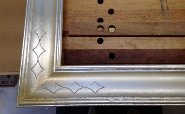
Diamond Motif in Silver
My goal as a framer is to add some element of the painting into the frame design, that’s where the diamond motif came into play; a take on the grills you’d find on cars built in the 60’s. When you think about the purpose of a frame, it’s secondary to the painting. Yes, the carving, gilding, and finishing need to be of gallery quality but it’s not the star of the show. The goal I’ve set for myself as a “boutique framer” is to create affordable frames for notoriously starving artists. I’ll be shamelessly commercial and ask those of you that follow my blog and are artists to contact me if you’re in need of a custom frame or other artists furnishings. I’ve begun to share some of my daily work pictures on Instagram and if you’re so inclined, follow me there as well. I may be well into my sixth decade but need to get into the 21st. Century!

Definitely a fan of the black frame as well, nice choice!
LikeLiked by 1 person
Although I preferred the silver to the gold..the black definitely makes it! Nice work, both of you.
LikeLiked by 1 person
If POP is what you want, the black does it! That makes the picture itself stand out. That’s what’s important.
Beautifully done!
LikeLiked by 1 person
Thanks for working this out to complement the painting so nicely!
LikeLiked by 1 person